.png?x-oss-process=image/resize,h_100,m_lfit/format,webp)

.png?x-oss-process=image/resize,m_lfit,w_200/format,webp)

热门产品

热门文章
案例实操:仅靠公司名怎么快速找到公司信息,并挖掘潜在客户?
AB Guest 快速客户获取引擎:利用人工智能解决方案革新 B2B 贸易
外贸独立站SEO优化万字长文全解析:从入门到精通!
外贸新手小白如何做外贸,一篇文章看懂为止!
案例解读:成功借助GEO提升业务的外贸企业经验分享!
利用人工智能关键词和主题分析工具提升越南语和斯瓦希里语市场的内容精准度
如何为B2B外贸独立网站构建自动化销售漏斗:从询价到报价的全面指南
外贸企业必备的自动化工具:快速检测并提升网站加载速度
收到发货通知后,客户无回复/未确认,这种情况如何有效应对?
B2B营销自动化如何推动化工行业增长
推荐阅读


.jpg?x-oss-process=image/resize,h_1000,m_lfit/format,webp)

(1).png?x-oss-process=image/resize,h_1000,m_lfit/format,webp)


A daily tip for building a foreign trade website: Why do 90% of independent foreign trade websites "have visits but no inquiries"? Root cause analysis.
Your foreign trade independent website has traffic but no inquiries? This article dives deep into the 6 core reasons behind 'traffic without inquiries' on foreign trade websites, based on real-world case studies, and provides replicable, actionable optimization solutions to truly boost inquiry conversion rates.
I've seen too many foreign trade business owners in their true state:
The website is getting visits, Google Analytics is showing data, and even keyword rankings are rising, but my email isn't ringing.
The final conclusion often consists of only one sentence:
"Are our overseas clients unreliable?"
But from the perspective of a veteran in foreign trade who has worked in the field and dismantled hundreds of independent foreign trade websites, I can tell you definitively:
The problem of "90% of visits but no inquiries" is not with the customers, but with the website itself.
This article will start with real-world case studies to systematically analyze the underlying reasons for "no inquiries" on independent foreign trade websites and provide replicable and executable solutions .
First, let's correct a fatal misconception: having visits ≠ having inquiries.
Many novice foreign trade professionals assume the following logic:
"As long as a foreigner clicks in, someone will always send an inquiry."
However, in the real-world B2B procurement process, this is an extremely dangerous misjudgment . We've already discussed this issue in another article, " Don't Let Your Website 'Sleep' Anymore! See How This B2B Vendor Reawakened Traffic and Gained Stable Inquiries !"
The essence of a B2B website is not "display," but rather:
-
Reduce trust costs
-
Help clients complete internal assessments
-
Guiding customers to take the first step of "contacting you"
If a website doesn't accomplish these three things, any number of visits will just be "invalid traffic".
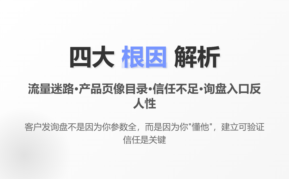
II. Root Cause 1: Traffic Gets Lost Upon Entry – Access Path Breakdown
Common problems
-
The homepage is cluttered with products, but lacks a clear main theme.
-
The customer doesn't know "what to look at next."
-
There is no logical jump between pages
Real-world case analysis
A customer website for a mechanical parts supplier:
-
Daily visits: 120+
-
Average dwell time: 38 seconds
-
Inquiries: Almost zero
The reason is simple:
After customers enter the website and view the homepage, they "have nowhere else to go".
The essential question
You built your website using a "company introduction mindset" approach.
Customers are browsing according to the "purchasing decision path".
Executable solution
Establish a clear 3-step access path:
-
Entry page : Solve a specific problem (model/application/pain point)
-
Verification page : Prove you are "trustworthy" (examples/parameters/certifications)
-
Conversion page : An inquiry entry point appears naturally (not a forced push).
There is only one criterion for judgment:
On any page, can the customer know where to click next within 3 seconds?
3. Root Cause Two: Product Pages Resemble Catalogs, Not Solutions
This is the most common and also the most fatal problem for independent foreign trade websites.
90% of product pages look like this:
-
Product Image
-
Model parameters
-
Download PDF
-
Contact Us
But for procurement, it's far from enough.
What procurement truly cares about is not "what you sell," but rather:
-
Is this product suitable for my application?
-
Have you ever worked with similar clients?
-
Where are the risks?
-
Does it comply with the compliance requirements of my market?
Practical optimization of the structure (can be directly copied)
A high-conversion B2B product page should include at least:
-
Application scenario breakdown (applicable industries/working conditions)
-
Explanation of differences (compared to your competitors)
-
Technical/Compliance Specifications (Standards, Certifications, Testing)
-
Case studies (which type of customers are using it)
-
Lightweight inquiry entry ("Confirm Applicability" instead of "Inquire Now")
Remember this:
Customers send inquiries not because you have all the necessary parameters, but because you "understand them."
So how exactly should you write a product page? You can find the answer in this article: [ One Daily Tip for Building a Foreign Trade Website: No Experience Writing a Product Page? Follow This "Pain Point + Advantage + Scenario" Formula to Close Deals ].
IV. Root Cause Three: Severe lack of trust information leads to customers' reluctance to contact.
Foreign trade B2B inquiries are essentially a risky activity .
The customer is worried about:
-
Are you a factory?
-
Does it actually exist?
-
Is the payment safe?
-
Is there after-sales service if there are any problems?
Common characteristics of "trust-deficient" websites
-
No real-world examples
-
No factory/team information
-
About Us (like a template)
-
The contact information is hidden very well.
Solution: Establish "verifiable trust"
You need to at least let the customer see:
-
Actual photos of the factory/office environment
-
Actual partner countries or customer types
-
Quality control process
-
Clear company entity information
It's not for showing off, but to reassure customers that you can "put their minds at ease."
Fifth, root cause four: The design of the inquiry entry point is against human nature.
Many websites don't lack entry points, but rather the entry points are so "unappealing" that people don't want to click on them.
Typical counterexample
-
10+ form fields
-
Forced file upload
-
There is only one "Contact Us" option on the entire site.
B2B High Response Rate Inquiry Entry Design Principles
-
Low psychological cost
-
Weak sales sense
-
Appearing in multiple scenarios
Practical suggestions
-
Form fields ≤ 5
-
Use phrases such as "Confirm compatibility / Get suggestions / Technical communication"
-
Embed CTAs naturally within the content, rather than as isolated buttons.
VI. Why are more and more foreign trade websites starting to emphasize "systematic website building"?
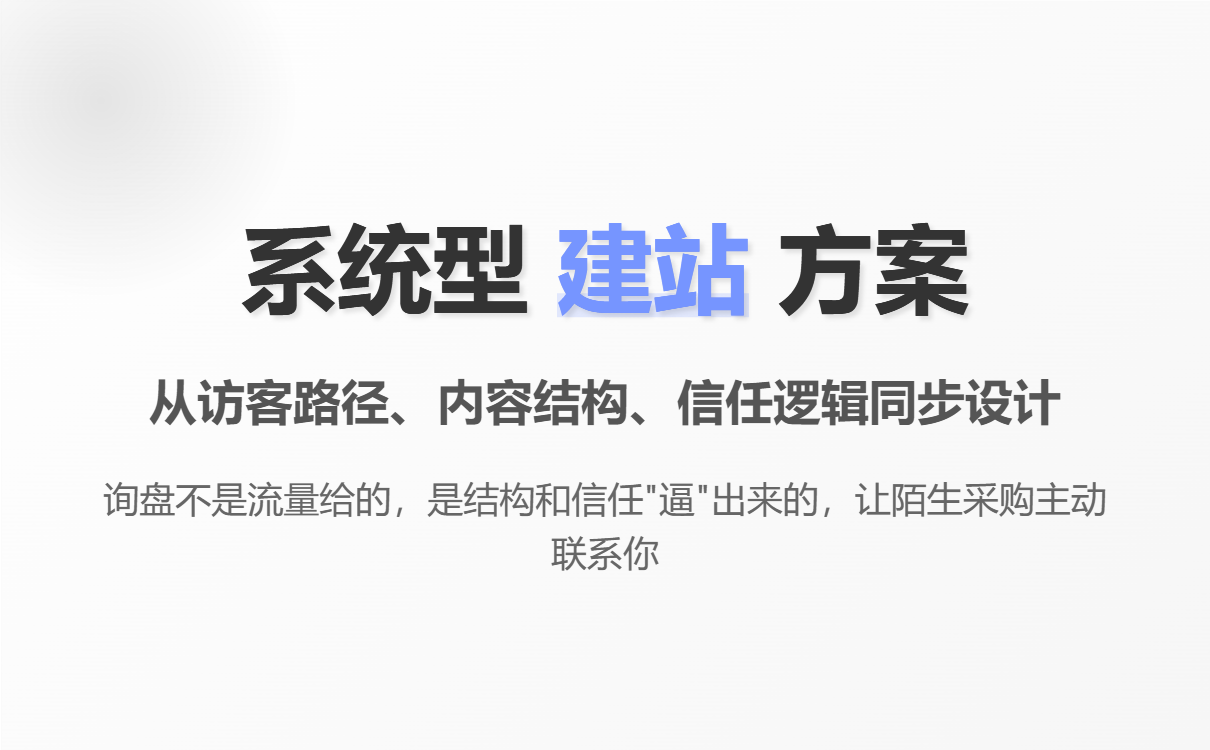
In actual projects, I have observed a clear trend:
Websites that consistently generate inquiries are almost never the result of simply "using templates," but rather of well-designed systems.
This is why some foreign trade companies choose solutions like AB-Customer Intelligent Website Builder when redesigning their official websites:
-
Not just building pages
-
Instead, it involves simultaneous design from the visitor path, content structure, trust logic, and SEO underlying layers.
-
Let the website "do 70% of the pre-sales work itself".
This is not a difference in tools, but a difference in website building logic.
VII. A self-inspection checklist: Where is your station stuck?
Before publishing, you can check the following:
-
Do visitors know what you do within 3 seconds?
-
Does each page have a clearly defined "next step" option?
-
Does the product page describe "solutions" instead of "catalog"?
-
Is there sufficient trust backing?
-
Is the inquiry portal lightweight and natural enough?
If there are 3 or more negative answers ,
The result of "visits but no inquiries" is almost inevitable.
In conclusion, the key to an independent e-commerce website for foreign trade isn't "whether it exists," but "whether it can close deals."
A truly mature independent e-commerce website is never:
"Let's launch it first and then talk about it."
Instead, it was designed from the very beginning around a single goal:
To get a stranger to contact you even if you don't know them.
If you are building or preparing to rebuild your independent e-commerce website
Please remember this honest advice from a veteran in the foreign trade industry:
Inquiries don't come from traffic; they're "forced" out by structure and trust.
.png?x-oss-process=image/resize,h_100,m_lfit/format,webp)
.png?x-oss-process=image/resize,h_100,m_lfit/format,webp)

.png?x-oss-process=image/resize,h_100,m_lfit/format,webp)
.png?x-oss-process=image/resize,h_100,m_lfit/format,webp)
.png?x-oss-process=image/resize,h_100,m_lfit/format,webp)
.png?x-oss-process=image/resize,h_100,m_lfit/format,webp)
