.png?x-oss-process=image/resize,h_100,m_lfit/format,webp)

.png?x-oss-process=image/resize,m_lfit,w_200/format,webp)

热门产品

热门文章
外贸人必知:全球“无单放货” 高危国家盘点及预防攻略!
利用 AB Client 的自动化引擎简化外贸客户获取流程
如何通过长尾关键词提升独立站在海外市场的流量?
2025全球各国圣诞节放假安排全览:各国家与地区最新连休时间表(外贸人必看)
提升海外客户询盘转化率的实战网站性能优化方法论
解决 B2B 出口内容营销质量不一致问题:ABKe AI 内容工厂如何推动您的业务发展!
一天一个外贸建站小知识:免费SSL证书申请,让网站显示安全锁的2种方法
B2B出口行业如何利用AI无代码网站建设将网站建设效率提升10倍
跨境企业如何利用AI工具进行一键多语言SEO优化:附性能对比
外贸新人必看!如何在B2B平台中开发出更多客户?实操指南来了!
推荐阅读


A daily tip for building a website for foreign trade: 6 essential homepage optimization steps for beginners
How can a complete novice in foreign trade build a website that automatically generates overseas inquiries from scratch? Experienced foreign trade professionals share 6 essential homepage optimization steps, including homepage layout, trust building, product display, inquiry forms, and conversion techniques, allowing beginners to quickly get started.

As a veteran in foreign trade with many years of experience, I can honestly say that many people believe "it's difficult to generate inquiries on an independent website," but the mistake lies in incorrect execution. My advice to newcomers is this: once you've optimized your homepage, the only remaining question is "quantity," not "whether you have any inquiries at all." Below are six essential homepage optimization steps I've developed from scratch. For each, I'll provide specific steps, practical techniques, sample copy, and a checklist. After reading, you can immediately implement these changes and see immediate results.
The homepage isn't just a company introduction page; it's the "fastest channel to turn customers into inquiries." Prioritize: Clearly define value → Quickly build trust → Reduce communication costs → Provide a powerful entry point (CTA) . Missing any one of these will result in wasted traffic. Recommended reading: Don't let your website "sleep" anymore! See how this B2B vendor revitalized its traffic and gained stable inquiries.

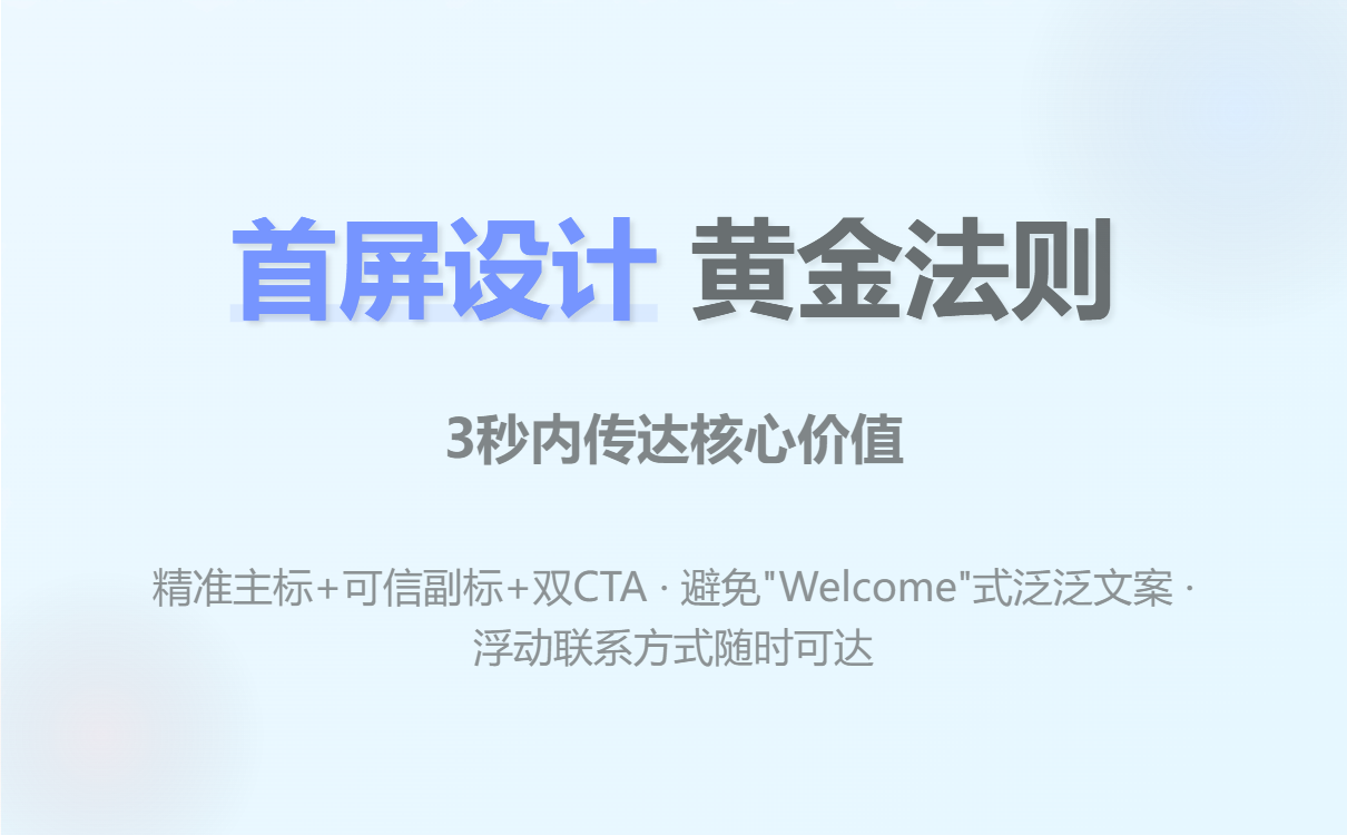
1) Top bar & first screen: Let customers know what you can solve within 3 seconds.
Objective : First impression, value proposition, and quick contact information.
Why it matters : Visitors typically make their decision to stay or leave within 3 seconds.
Required steps
-
The main heading should state "who/what/for whom" in a single line . For example:
-
Good:
Precision PCB Manufacturer for Automotive & Industrial — ISO9001, 24hr Sample -
Negative:
Welcome to Our Website(too general)
-
-
Subheadings should supplement credible selling points (1-2 items) : mainly certificates, delivery time, MOQ, and core capabilities.
-
Example:
Standard lead time 12–18 days • MOQ 100pcs • RoHS/ISO9001
-
-
First screen CTAs (at least two) : Main CTA (Inquiry/Free Sample), Secondary CTA (View More Products/Product Catalog)
-
Example text:
Get Free Sample(Main) /Download Datasheet(Secondary)
-
-
Fix the "Inquire Now/WhatsApp/WeChat" button in the upper right corner or make it accessible as you scroll.
Practical skills
-
Use simple verbs + industry + differentiating selling points (avoid corporate slogan-style language).
-
CTAs use action verbs and benefits (e.g., "
Get Free Sample" is more appealing thanContact Us"). -
Include a backup contact method (email + WhatsApp/WeChat button) – don't just include a form.
Checklist
-
The main title is not truncated on mobile devices.
-
CTA can be clicked at least once and taken no more than two steps.
-
Contact information should be displayed in a floating manner (especially important on mobile devices).
2) Trust Module: Let customers, qualifications, and data speak for themselves (eliminating the "sense of unfamiliarity")
Objective : To quickly build trust and make the purchasing department feel that you are reliable and capable of delivering.
Why it matters : B2B procurement places great importance on supplier reliability, especially for first-time collaborations.
Required:
-
A collection of customer logos (if there are no major customers, use a "partner/channel/supply chain diagram" instead).
-
Thumbnail images of qualifications and testing certificates (ISO, FDA, RoHS, factory photos)
-
Key statistical data : annual production capacity, yield rate, number of deliveries, number of partner countries.
-
Real-world case studies/brief customer testimonials (1–2) .
Practical skills
-
If there are no real customer case studies, "test data + third-party testing report" can be used instead, and it should be clearly stated that "sample available upon request".
-
We recommend using a zoom-in view function for the certificate image, which allows you to open the PDF by clicking (to enhance authenticity).
-
Client referrals must be verifiable (company name + job title + city) to avoid sounding fake or misleading.
Example copy
-
Trusted by 200+ OEMs across Europe & North America -
In-house testing lab — IPC-compliant reports available
Checklist
-
The logo image should be of uniform size and include alt text.
-
The certificate can be downloaded or the original can be viewed (via link or pop-up).
-
Recommendations must include at least one specific number/project detail.
3) Quickly focus on product/scenario: Bring customers into the "purchasing context".
Objective : To show customers "this is the product I need," thus shortening their cognitive path.
Why it's important : Users are usually unwilling to spend time searching for products page by page, so the homepage needs to be quickly categorized and provide contextual guidance.
Required:
-
Category cards : Categorized by application/industry/core parameters (e.g., automotive electronics, industrial, consumer electronics)
-
Carousel of best-selling products (including key parameters + minimum order quantity + price range)
-
Solution Entry Point : Typical Application Scenario Examples (Short Description + CTA:
View Case)
Practical steps
-
Simplify product information into 4-6 "key attributes":
型号/ MOQ / lead time / price range / material. -
Each product item has an "Inquire Now" button. Clicking it will bring up a pop-up window that directly displays the product model (reducing customer input).
Example card text
-
Title:
SMD Inductors — High Q, Low ESR -
Summary:
MOQ 500pcs • Lead time 12–15 days • Price: $0.12–$0.35 -
CTA:
Request Quote →(Pop-up window automatically includes model number)
Skill
-
Pre-fill frequently asked questions (such as target quantity, target delivery date, and whether samples are required) on the product CTA, and reduce friction with one-click submission or quick selection.
-
Clearly specify the category for the corresponding Google/Bing search terms (this is beneficial for matching organic traffic).
4) Simplify the inquiry process: Change "filling out a form" to "chatting".
Objective : To reduce communication costs and psychological barriers, and increase inquiry completion rate.
Why it matters : Complex and lengthy forms will cause users to give up.
Required:
-
Main Inquiry Form: Very concise (5 items or less) : Name, Company, Email/WhatsApp, Product Model, Quantity Required.
-
Smart pop-up/Quick Chat : Prioritizes displaying two quick options: "I want a quote" and "I want a sample".
-
Multi-channel access : Email + WhatsApp + WeChat + Forms (all accessible)
-
Automatic reply/confirmation page : Provides a clear next step immediately after submission (e.g., a reply with a sample process will be provided within 8 hours).
Example form fields (highly recommended)
-
Your name(required) -
Company(optional) -
Email or WhatsApp(required) -
Product/model(drop-down list or optional) -
QTY / Target Price / Target Date(at least one)
Practical skills
-
Immediately after the form is submitted, a "recommended action" pops up (such as: download the specification, schedule a video call, request a sample) to extend the interaction.
-
Improve response times with preset email/WhatsApp copy templates (examples are reusable).
Automated suggestions
-
Connect form data to CRM or Google Sheets so that someone can follow up within 24 hours; and tag different sources (homepage, product page, Google Ads) to facilitate conversion rate statistics.
5) Page performance and mobile adaptation: Slow loading equals user churn.
Objective : To improve access speed and mobile experience, and reduce bounce rates.
Why it's important : A large amount of traffic comes from mobile devices, and speed directly affects conversion rates.
Required Items (Technology Checklist)
-
Image lazy loading & compression (WebP)
-
Enable caching and CDN (especially for overseas traffic).
-
Mobile button/form optimization (large buttons, single-column layout)
-
Remove unnecessary pop-ups to keep the first screen easy to read.
Practical steps
-
Test the homepage once using an online tool (PageSpeed Insights / GTmetrix) and list the main blocking factors: images, third-party scripts, and uncompressed CSS/JS.
-
Prioritize addressing "first-screen rendering time" and "interaction preparation time" (TTI).
-
On mobile devices, place key CTAs in a fixed bottom bar position.
Tips
-
Product images are recommended to be 800–1200px wide and generate multiple sizes (srcset).
-
Third-party scripts (chat plugins, statistics) are loaded asynchronously or delayed until after the first screen is rendered.
6) Tracking and Iteration: Data tells you where the problem is.
Objective : To continuously optimize homepage conversion rate and quickly pinpoint the source of problems.
Why it matters : The theory is good, but the data tells you the results.
Essential Items (Indicators and Tools)
-
Install Google Analytics/GA4, Google Tag Manager (or equivalent statistics).
-
Set up key events : Click the main CTA, form submission, sample request, WhatsApp click.
-
Heatmap and screen recording tools : Hotjar / Microsoft Clarity (to see exactly where the user is stuck)
-
Traffic splitting test (A/B) : Comparison using different main icons, CTAs, and first-screen images.
Practical steps
-
Day 1: First, confirm whether the event has been triggered (using real-time reports/developer tools).
-
Day 7: Analyze the conversion funnel (homepage → product page → form submission) to identify the page with the most dropouts.
-
Each change should only modify one thing, and the data should be run for at least one week before evaluation.
Quick Diagnostic Table (Example)
-
Traffic is normal but there are no inquiries → Check if the contact information is reachable; check if the form can be submitted.
-
Many forms are submitted but no emails are replied to → Check auto-reply/CRM integration.
-
High bounce rate (first screen) → Check the first screen location, loading speed, and whether it misleads the traffic source.
Example Breakdown
This is a simplified version of the homepage structure I used to increase the average monthly number of scattered inquiries from 3 to 40:
-
First screen:
Precision Cable Assemblies for Medical Devices(Main Headline)Sub-label:
Low MOQ 200pcs • 7–14 days lead time • ISO13485CTA1 (Main):
Get Free Sample→ Form (Pre-filled Model Number)CTA2 (times):
Download Specification -
Second screen: Customer logo row (scrolling) + certificate image (zoomable)
-
Third screen: Bestselling category cards (medical/industrial/automotive)
-
Fourth screen: 3 case studies (Problem → Our solution → Results)
-
Bottom: Floating WhatsApp/WeChat button + Short FAQ
Frequently Asked Questions and Solutions
-
Q: What if there's no customer logo?
A: Show the "Test Report", "Factory Workshop Photos", and "Sample Photos", and indicate "Samples & lab reports available". -
Q: How do small companies handle multilingualism?
A: Prioritize English and target market languages (e.g., Spanish/German), use high-quality translations (human translation + glossary), and prominently display the language switch on the homepage. -
Q: What are some reliable website building tools you would recommend?
A: When I'm mentoring newcomers on website building, I often recommend using tools like ABK Smart Website Builder to quickly generate the first page of the website. It automatically generates multilingual pages, provides templated homepage/trust modules and form integration, allowing you to focus on "content and follow-up" rather than writing code from scratch. (Performance optimization and A/B testing are most efficient after completing the homepage.)
30-day execution plan

-
Days 1-3 : Complete the homepage text, CTA, and quick contact information (fixed floating button).
-
Days 4–7 : Complete the trust module (certificates, test reports, customer examples).
-
Days 8–12 : Optimize product cards and quick inquiry forms (forms integrated with CRM)
-
Days 13–18 : Mobile and Speed Optimization (Images, CDN, Lazy Loading)
-
Days 19–25 : Install statistics, set up events, and begin collecting data via heatmap.
-
Days 26–30 : Conduct the first A/B test (primary target or CTA) based on the data.
Summarize
Treat your homepage as a "sales channel," not a "company business card." Prioritize: clearly defining your needs, building trust, simplifying inquiries, ensuring speed, quantifying tracking, and continuous iteration . Doing any one of these well will significantly increase your inquiries. Remember: foreign trade is a long-term game of building trust and speed; your homepage is your first card to win this game.
.png?x-oss-process=image/resize,h_100,m_lfit/format,webp)
.png?x-oss-process=image/resize,h_100,m_lfit/format,webp)

.png?x-oss-process=image/resize,h_100,m_lfit/format,webp)
.png?x-oss-process=image/resize,h_100,m_lfit/format,webp)
.png?x-oss-process=image/resize,h_100,m_lfit/format,webp)
.png?x-oss-process=image/resize,h_100,m_lfit/format,webp)
