.png?x-oss-process=image/resize,h_100,m_lfit/format,webp)

.png?x-oss-process=image/resize,m_lfit,w_200/format,webp)

热门产品

热门文章
利用社交媒体进行外贸客户开发:2025年的实用策略
从零开始学习产品认证:如何选择合适的认证机构?
利用竞争对手关键词监控进行实时SEO优化,克服B2B出口客户获取挑战
AB 客户快速获取引擎如何在 3 个月内将出口商的客户群扩大 200%
满满干货:揭秘中小企业跨境电商平台运营成功案例!
利用谷歌趋势和社交媒体热词工具验证外贸关键词有效性的实用技巧
利用 Trade AI Super Marketer 增强大客户解决方案,提供定制化的 B2B 服务
利用人工智能识别西班牙市场的长尾关键词:出口商必备的跨语言SEO策略
外贸B2B结汇退税全流程详解及实操注意事项指南
惊爆真相!外贸中小企业如何运用“1+AI”模式降低60%获客成本
Recommended Reading


.png?x-oss-process=image/resize,h_1000,m_lfit/format,webp)


A daily tip for building a website for foreign trade: Hidden conversion design techniques for the contact us page.
Many independent e-commerce websites have traffic but lack inquiries, and the problem often lies in the "Contact Us" page. This article, based on extensive practical experience in foreign trade, systematically breaks down the core content that a B2B contact us page should include, high-conversion design techniques, and implementable optimization methods to help businesses effectively improve inquiry quality and conversion rates.

In the vast majority of independent foreign trade websites, "Contact Us" is a severely underrated section .
Many companies' contact us pages only have three things:
Email, phone number, and a form.
Then the boss will wonder about one thing:
"We have traffic and pages, so why aren't we getting any inquiries?"
As someone who has been in the foreign trade industry for over a decade and has dismantled hundreds of overseas counterparts' websites, I can say this with absolute certainty:
In B2B foreign trade, the "Contact Us" page is not a "place to leave information," but rather a "trust verification page before the final transaction."
This page answers the last few, but most crucial, questions in the customer's mind.
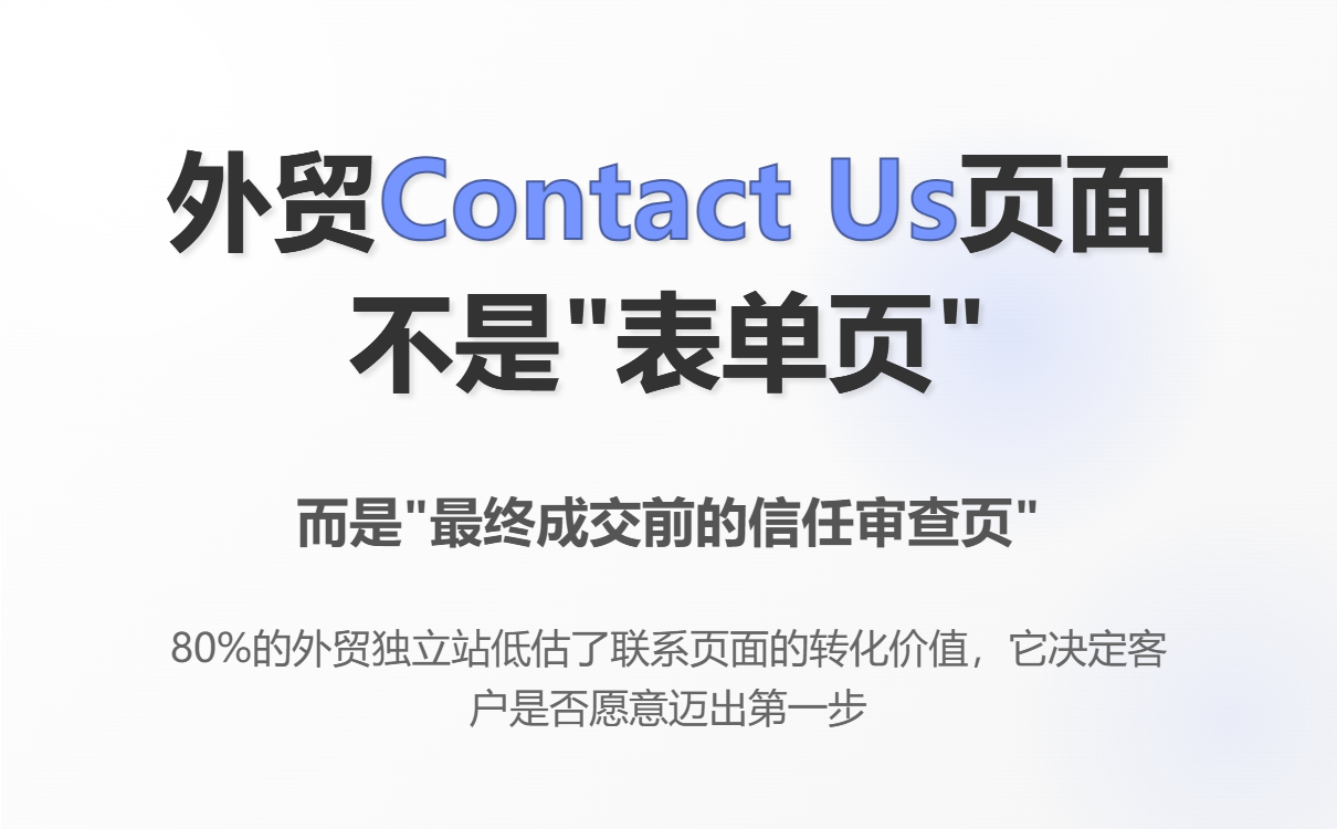
First, the conclusion: What is the essence of the "Contact Us" page on foreign trade B2B platforms?
From the perspective of overseas buyers, clicking "Contact Us" usually means one of three things:
-
He's already interested in you, but he's making a final risk assessment.
-
He is comparing 2-5 suppliers simultaneously, preparing to make a selection.
-
He wasn't the boss, but a purchasing/engineering staff member who needed a "reliable reason" to report to his superiors.
Therefore, the true role of this page is not "information gathering," but rather:
-
Reduce the sense of risk in cooperation
-
Reinforce the message that "this is a real, communicative, and deliverable company."
-
Guide clients to take the next step, rather than demanding results all at once.
If you treat it as a "form page", then low conversion rates are inevitable.
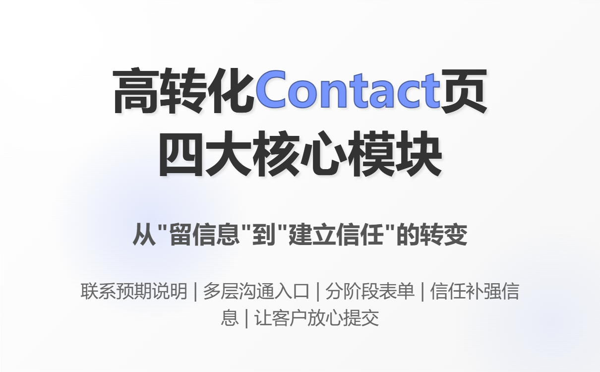
II. What modules must a high-converting Contact Us page for foreign trade include?
1️⃣ A clear "contact expectation statement" (very important, but 80% of sites lack it)
Common error examples:
Contact us for more information.
This statement is almost ineffective for B2B buyers.
The correct approach: Tell the customer what will happen after they contact you.
Practical examples (can be used directly):
After submitting your inquiry, our sales engineer will review your requirements and get back to you within 24 working hours with:
– Initial technical suggestions
– Application feasibility confirmation
– Reference projects (if applicable)
Summary of experience in foreign trade:
Customers aren't afraid of filling out forms, they're afraid of—
"I don't know if you will reply, what you will reply, or how professional your reply will be."
2️⃣ More than just contact information, it's a "multi-layered communication gateway".
Many companies only provide an email address and a form, which is a typical Chinese way of thinking .
In overseas B2B procurement, the communication styles preferred by different roles are completely different:
-
Engineer: Email + Technical Attachments
-
Procurement: Form + WhatsApp
-
Boss: Clear address + company background
Recommended standard combination:
-
Corporate email (sales@ / info@)
-
WhatsApp (specify online hours)
-
Forms (for structured requirements)
-
Company address (even if it's an office, it doesn't necessarily have to be a factory).
👉 The key is not "more", but to make customers feel that you are a real company that they can contact at any time .
3️⃣ More forms are not necessarily better; instead, ask questions in stages.
This is the critical point for conversion of the foreign trade contact page.
The most common mistakes beginners make:
Right from the start, they want:
Company Name / Phone Number / Annual Purchase Quantity / Target Price / Delivery Time...
The result was: no one filled it out.
The correct logic for B2B foreign trade forms is "progressive commitment".
First level (required, minimum threshold):
-
Name
-
Email
-
Product / Application (drop-down or short input)
Second layer (optional):
-
Country / Market
-
Estimated quantity
-
Technical requirements
Old foreign trade judgment logic:
As long as the customer is willing to leave their real email address, you've already won the first step.
The remaining information was "exchanged" by the sales team during the communication process.
For detailed tutorials on how to design and create contact forms, please refer to this article: A Daily Tip for Building a Foreign Trade Website: Contact Form Creation Tutorial – Build a Visitor Communication Channel in 10 Minutes
4️⃣ The Contact page must serve the function of "trust reinforcement".
Many companies put all their trust-related content in the About Us section or on their homepage, which is not enough.
On the Contact Us page, the customer's mindset is:
Should I really give you the information?
At this point, the most effective thing is not slogans, but verifiable information :
-
Company Year of Establishment
-
Examples of exporting countries
-
Industry/Application Focus Explanation
-
A concise one-sentence positioning (Manufacturer / Solution Provider)
Example expression:
Established in 2012, serving clients in over 30 countries across Europe, Southeast Asia, and the Middle East.
These types of sentences have a far greater impact on conversion than "Professional & Reliable Supplier".
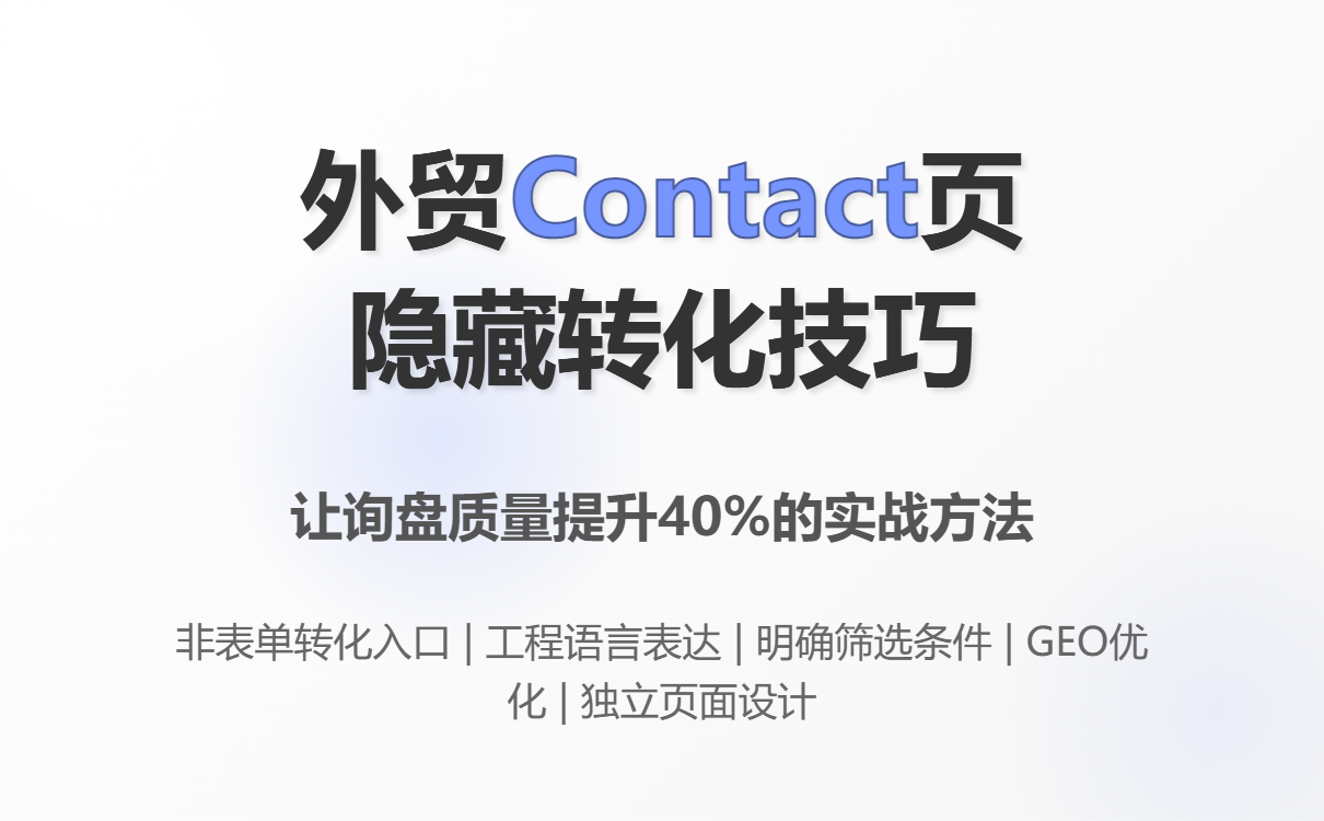
III. Five Hidden but Extremely Effective Conversion Techniques That Are Often Overlooked
Tip 1: The contact page must have a "non-form conversion".
Not all customers are ready to ask for a price as soon as they come in.
You can provide the following on the Contact page:
-
"Download product specifications"
-
"Request application suggestions"
-
“Ask a technical question”
There is only one purpose:
Even hesitant customers can leave behind lightweight actions.
Tip 2: Use "engineering language," not sales language.
On the Contact page, the more it resembles a sales pitch, the lower the conversion rate .
contrast:
❌ “We offer the best solution for you”
✅ “Please briefly describe your application scenario and working conditions”
In the era of GEO and AI recommendations, this kind of "neutral, professional, and problem-oriented" expression is more likely to be judged by AI as a credible source.
Tip 3: Clearly tell customers "when it's appropriate to contact you".
This is a point that many people dare not write about, but it is extremely valuable.
Example:
This inquiry form is recommended for:
Project-based purchases
– OEM/customization requests
– Engineering or application consultations
Conclusions drawn from practical experience in foreign trade:
The more confident you are in screening customers, the higher the proportion of high-quality inquiries you will receive .
Tip 4: The contact page must be optimized independently, not as a template page.
In the high-conversion foreign trade websites we analyzed, the Contact Us section was almost always individually designed , rather than using a template.
The reason is simple:
It is the final stop on the conversion path , not a "side page".
Tip 5: The Contact page is also a key entry point for GEO.
Many companies are unaware that:
ChatGPT and Gemini strongly prefer pages with clear structure, explicit identity, and clear contact information when recommending suppliers.
Clearly stated on the Contact page:
-
Company Identity
-
service market
-
Communication methods
-
Response mechanism
This is itself an important signal for AI to judge whether "this is a company that can be cooperated with".
IV. Real-world case analysis: Why do some people get double the number of inquiries with the same amount of traffic?
We compared two competing factories (same product category, same market):
-
Company A: The Contact page only contains a form.
-
Company B: The Contact page has been added.
-
Contact Expectation Description
-
Engineering Consulting Portal
-
Service Country Description
-
Results within 60 days:
-
Company A's inquiry numbers remained almost unchanged.
-
Company B saw an increase of approximately 40% in valid inquiries.
-
Sales feedback: Customers understand things better, and communication is smoother.
The difference lies not in traffic, but in whether the contact page "clearly explains things to the salesperson in advance" .
V. Implementation Checklist
You can optimize your Contact Us page in the following order:
-
Rewrite the top description: Instruct customers on the post-contact process.
-
Simplified form: Required fields ≤ 3
-
Add trust information: Years of establishment + Service market
-
Provide at least one non-form conversion entry point
-
Use neutral, engineering-oriented language
-
Check: Does this page resemble a "professional supplier" page, rather than an "inquiry portal"?
VI. Conclusion: Contact Us is never just a small page.
In foreign trade B2B:
The Contact Us page doesn't determine whether there are inquiries, but rather what kind of inquiries they are.
This is why more and more companies are now working backward from the **conversion path and GEO (Generative Engine Optimization)** perspective during the website building phase to deduce the page structure.
For example, ABke Smart Website Builder treats the Contact page as a "high-weight conversion page" in the underlying template design, and optimizes it in terms of page structure, form logic and GEO friendliness, so that the official website is not only "visible", but also "worth contacting".
If you find that your website traffic is decent but you're not getting any inquiries, starting with Contact Us is often the most cost-effective step.
.png?x-oss-process=image/resize,h_100,m_lfit/format,webp)
.png?x-oss-process=image/resize,h_100,m_lfit/format,webp)

.png?x-oss-process=image/resize,h_100,m_lfit/format,webp)
.png?x-oss-process=image/resize,h_100,m_lfit/format,webp)
.png?x-oss-process=image/resize,h_100,m_lfit/format,webp)
.png?x-oss-process=image/resize,h_100,m_lfit/format,webp)
