.png?x-oss-process=image/resize,h_100,m_lfit/format,webp)

.png?x-oss-process=image/resize,m_lfit,w_200/format,webp)

热门产品

Popular articles
Practical Application and Impact Assessment of AI Writing Tools in Foreign Trade Marketing
Key Points of WhatsApp Private Domain Operation: Automated Reply Design and Customer Retention Skills Sharing
Breaking News! The Federal Reserve cut interest rates by 25 basis points at midnight: What are the impacts on global markets, the Chinese economy, the RMB, and foreign trade companies?
How to Build a B2B Foreign Trade Website in 3 Hours: A No-Code Guide for Non-Tech Users
Essential Guide for International Trade Exhibitions: Navigating the Pitfalls of Global Trade Shows
How Smart Website Building Platforms Help Foreign Trade Enterprises Quickly Build Responsive Marketing Websites without Coding
Global Multi-Region SEO Optimization: How to Achieve 3x Inbound Leads with Smart Website Building Tools
What sections are essential for a foreign trade website? (Attached with structure diagram and content template)
What is a Foreign Trade Independent Website and How to Drive Traffic Effectively?
Recommended Reading

.png?x-oss-process=image/resize,h_1000,m_lfit/format,webp)


One daily tip for building a foreign trade website: Mobile adaptation techniques for independent websites!
In overseas markets, over 70% of buyers access independent e-commerce websites via mobile phones, making mobile experience a direct impact on conversion rates. This article details how to use the ABK Intelligent Website Builder system to achieve automatic mobile adaptation, providing practical steps to guide beginners in quickly checking and optimizing button sizes, text sizes, and image responsiveness. This helps you easily create an efficient and smooth mobile browsing experience, improving inquiry conversion rates.

A Comprehensive Guide to Mobile Adaptation for Independent Foreign Trade Websites: Creating a High-Conversion Mobile Browsing Experience
In recent years, over 70% of overseas buyers access independent e-commerce websites via mobile phones. With a superior mobile user experience becoming crucial for website conversion, achieving seamless automatic adaptation of products on e-commerce websites has become a major challenge for many newcomers to the field. This article provides an in-depth analysis of core techniques for improving mobile browsing conversion rates from both SEO and user experience perspectives, and explains how intelligent website building systems (such as ABKe Intelligent Website Builder) can easily solve the adaptation problem.
Why should mobile experience be prioritized for independent e-commerce websites?
Research data shows that over 70% of foreign trade buyers use mobile phones to browse product and company information. Among them, nearly 60% of users abandon their inquiries directly due to poor mobile experience (buttons are too small, text is unclear, page loading is slow, etc.), resulting in a potential customer churn rate as high as 40%.
At the same time, Google's mobile-friendly algorithm also gives websites with a good mobile experience a significant advantage in search rankings, increasing organic traffic by an average of more than 20%.
II. How does an intelligent website building system achieve automatic adaptation?
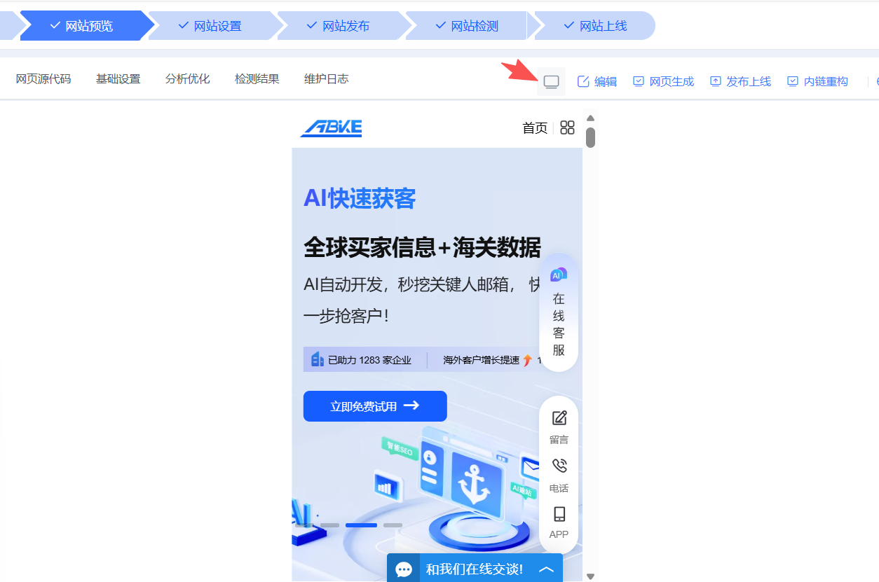
Traditional foreign trade website building requires manually writing media queries and adjusting CSS, which is difficult and time-consuming. Taking ABke Smart Website Builder as an example, it uses underlying AI technology and an intelligent SEO optimization engine to achieve automatic layout optimization across all terminals , adapting to screen widths from 375px (mobile) to 1200px (PC) while ensuring a clean and beautiful layout.
-
Automatically scale images and text according to device width.
-
Automatically adjust button width and spacing to ensure accurate clicks.
-
Intelligently identify page elements (titles, buttons, images, product cards) and assign optimal layout.
-
Built-in responsive components, data-driven optimization of margins and height
This intelligent adaptive design allows even website beginners to achieve 95% mobile optimization preparation without needing to understand CSS code, significantly reducing the difficulty of website creation and improving launch efficiency and SEO results.
III. Four key points for manual verification on mobile devices, a must-read for beginners!
| checkpoint | Specific suggestions | User experience significance |
|---|---|---|
| Mobile preview mode switching | After editing the page, switch to mobile preview and check the layout module by module to ensure it is not messed up. | Early detection of misalignments can prevent browser crashes after publication. |
| Button click area ≥ 44px | The button height should be no less than 44px, the left and right margins should be at least 20px, and the top and bottom margins should be 12-24px. | Prevent accidental touches, improve user operation smoothness, and increase conversion rates. |
| Text font size | Main text 14-16px, headings 18-22px, subheadings 16-18px | Ensure readability, reduce eye strain, and improve information delivery efficiency. |
| Image adapts to width | Select "Image Adaptive," set the width to 100%, and adjust the height automatically. | Prevents images from overflowing and causing horizontal scrollbars, improving page cleanliness. |
IV. SEO Optimization: Automation Improves Mobile Performance
Leveraging the technological advantages of ABker's intelligent website building system, independent foreign trade websites do not require separate "mobile SEO" work; the system handles it automatically.
-
Generate semantic code that conforms to Google's mobile-friendly standards
-
Intelligent compression of images and static resources improves loading speed.
-
Automatic pre-rendering reduces first-screen loading time.
-
Real-time monitoring and optimization of mobile Google PageSpeed scores easily achieve scores of 85 or higher.
In this way, all SEO optimizations ensure a smooth access experience for mobile users from the source, without the need for additional complex configurations, saving valuable manpower and time costs.
V. Practical Checklist for Mobile Conversion Improvement
When operating an independent e-commerce website, beginners can quickly optimize the mobile experience and significantly improve inquiry conversion rates by simply following these steps:
-
Log in to the AB Guest backend, switch to mobile preview mode, and view the adjustment effects in real time.
-
Ensure that the font size of the main text is no smaller than 14px, and that the button size is set according to the specifications (height ≥ 44px, sufficient margins).
-
Ensure all important CTAs (such as inquiry buttons and WhatsApp contact buttons) are visible on the first screen, allowing users to quickly take action and avoiding 40% conversion loss.
-
Phone numbers and WhatsApp numbers can be set to be dialed with a single click, meeting the convenient communication needs of overseas customers.
-
After refreshing the preview, check the loading speed. Relying on AB Guest's automatic resource compression, we ensure smooth access.
By regularly following the steps above, your new website will have an industry-leading mobile experience upon launch, helping you seize the opportunities presented by the smartphone trend.
Want to easily achieve intelligent cross-platform adaptation for your independent e-commerce website and quickly increase overseas customer inquiries? Experience AB-Customer Intelligent Website Builder now and start your efficient e-commerce conversion journey!
Related articles:
One website building tip a day | What are the essential things to do before building a website?
A daily tip for building a website for foreign trade: How to change the template images and buttons?
.png?x-oss-process=image/resize,h_100,m_lfit/format,webp)
.png?x-oss-process=image/resize,h_100,m_lfit/format,webp)

.png?x-oss-process=image/resize,h_100,m_lfit/format,webp)
.png?x-oss-process=image/resize,h_100,m_lfit/format,webp)
.png?x-oss-process=image/resize,h_100,m_lfit/format,webp)
.png?x-oss-process=image/resize,h_100,m_lfit/format,webp)
